_(1000, 1000)_mono.svg)

LTR Kosmik is a hand-lettered sans serif with a little texture and a lot of charm. Drawn initially for dialog balloons in comics, its superpower is that it contains three alternates for each letter. Some very clever opentype features cycle through the alternates ensuring that repeated letters are not identical – greatly enhancing the handdrawn quality of the text.
|
Licenses for Desktop, Web, App.
Pricing starts at €40 |
|
LTR Kosmik was drawn in 1993, four years before the OpenType specification was published. Erik van Blokland and Just van Rossum engineered the glyph variations using nothing more than PostScript and a few obscure features then found in printers. Back in the day we called this technique “flipperfonts”, because the printer actually flipped through the three alternates.
To maximize variation in this OpenType version, stylistic sets with different switching patterns were added so you can set each frame of an animation to a different starting shape. Assuming your animation tool is up for that sort of thing of course. CSS can absolutely do it. Check the Stylistic Sets in the typetesters to see what we mean.
Video: LTR Kosmik animated by selecting different stylistic sets that stagger the order of the alternates.
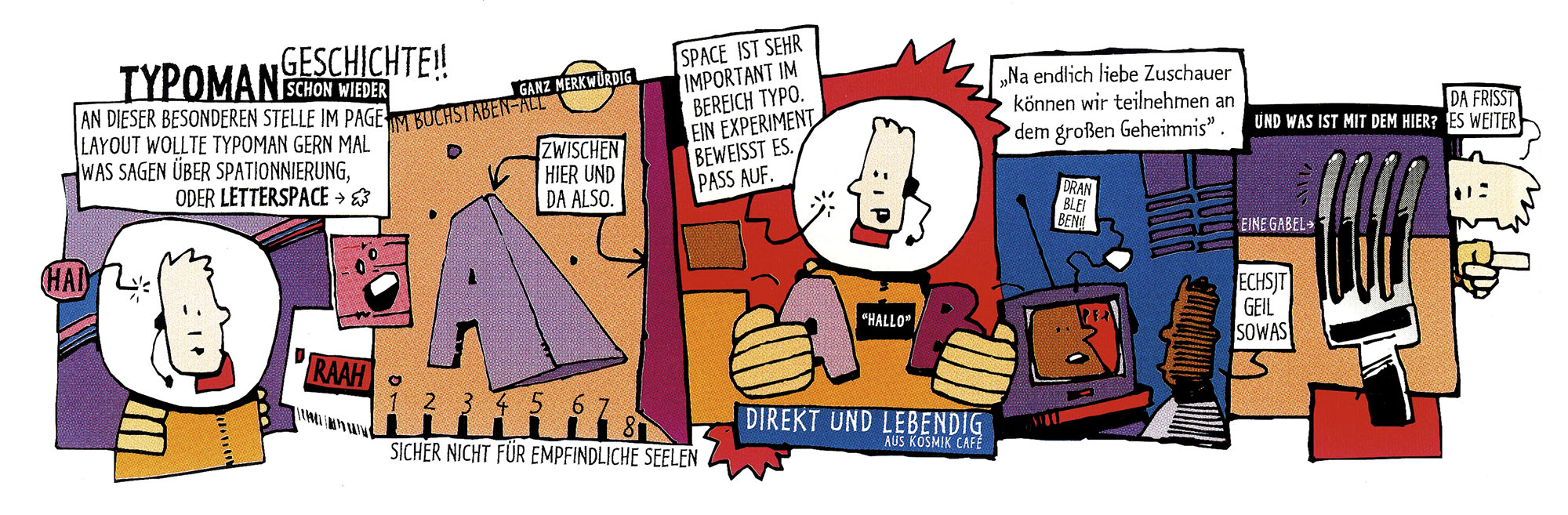
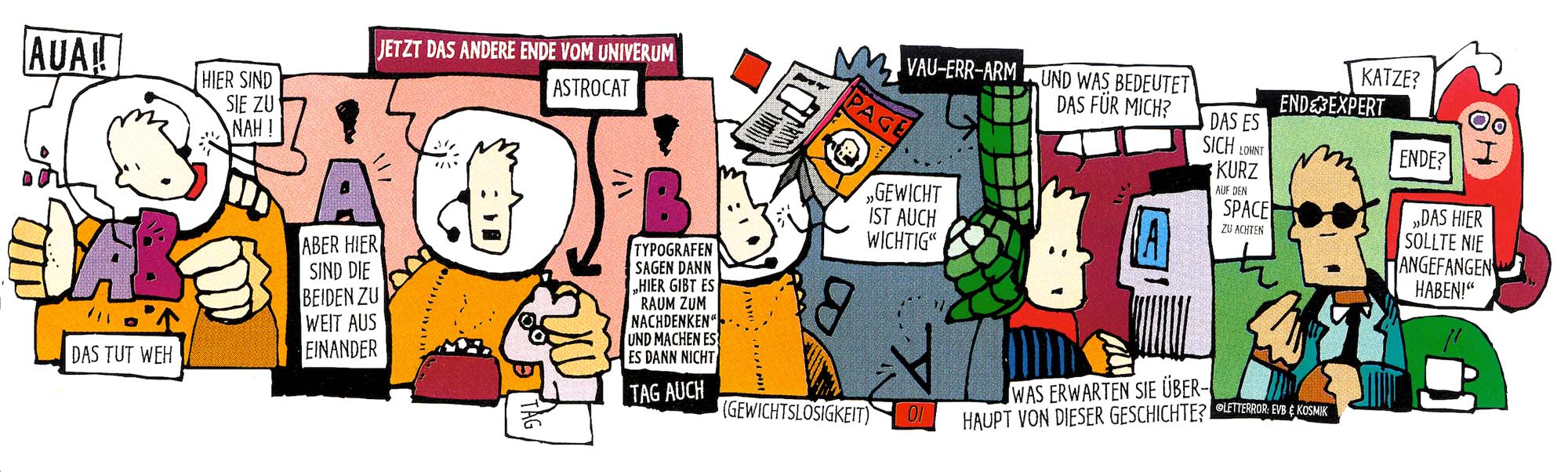
Typoman cartoons were drawn for the feature on Kosmik in Page Magazine in 1994.
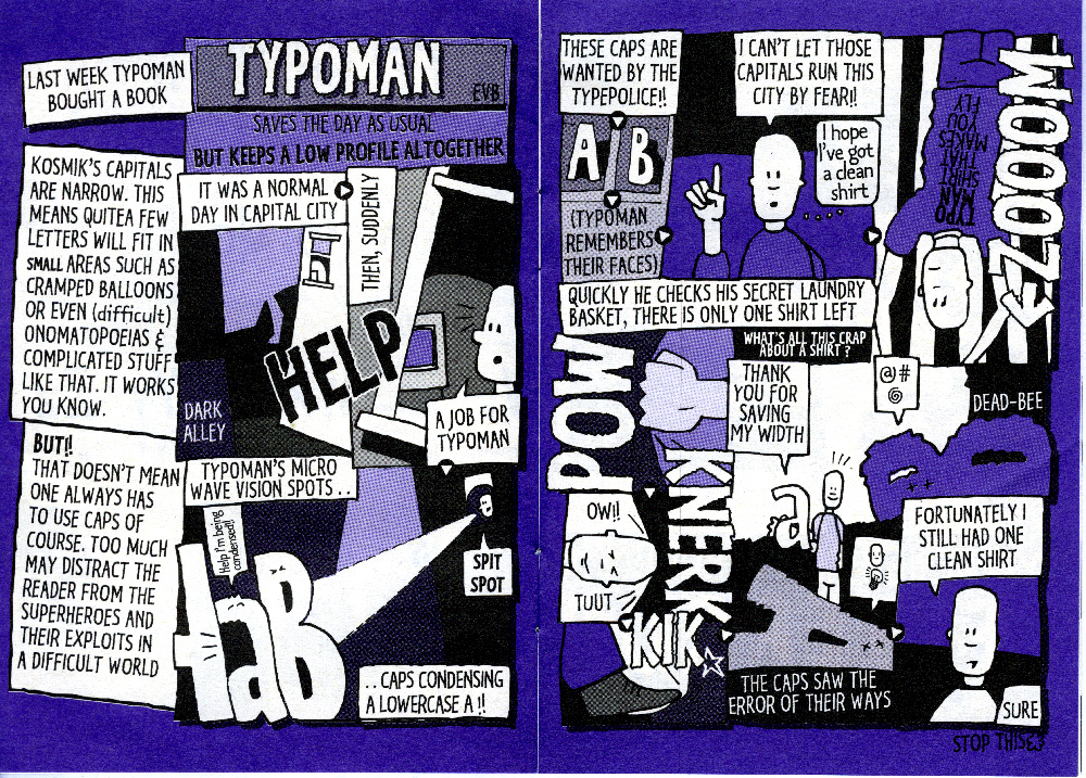
In the ’90s, typographic superhero TypoMan did his best to save quality typography. A cool A6 type “zine” was produced chronicling his escapades. Extremely rare, highly collectible.