_(1000, 1000)_mono.svg)
Students of the TypeMedia course, TypeMedia alumni and a couple of professional type designers were asked to interpret and digitize a scanned image of a printed letter: shown below, a 12 point Caslon, probably a Monotype version from an Enschedé specimen. They could use their favorite font editor, and interpret the outline as they normally would.
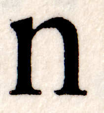
The original image that was shared with the participants
There are some industry wide, well established rules for constructing letter forms in Bezier paths. These are best practice guidelines: not as strict as technical limitations. Even when following these rules there are almost no right or wrong solutions: each glyph shows how the designer interpreted the image. Similar to different musicians playing the same piece of music, none of them are more valid than others. The experiment resulted in unique glyphs. Stems are sometimes drawn straight, sometimes curved. Corners are sometimes sharp, or drawn with short straight sections, or completely curved. Scale is different for each contribution: each designer followed his/her own workflow and methods. Some used RoboFont. Some used FontLab.
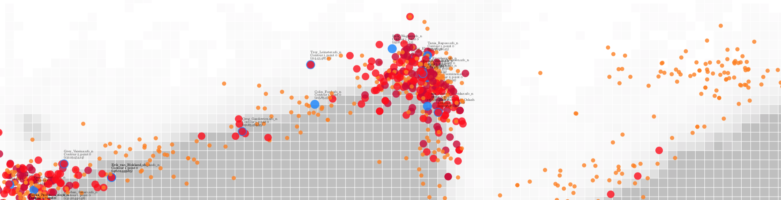
In order to show the data, I looked for a method of comparing the outlines without having to interpret, indicate landmarks, or measure things in the shape. It had to be a comparison independent of size, scale or point structure. Manual measuring would bias the results. Procrustes analysis can be used to remove scale and position from comparison. This is possible by calculating the surface area and the center of gravity of the shape. A glyph surface area can be measured by iterating over a grid of points (with a chosen density) and keeping a tally of points that are inside the shape. The total of points inside the shape is an indication of its surface. We can then calculate a scale factor that makes each glyph have the same surface area. An approximation of the center of gravity is found by taking the average of all of the coordinates that tested inside the shape. Combining the scale and centering brings all contours together. There are still differences between the glyphs, but the variation between the contours are now evenly distributed in a narrow band around the shape. Compare the spread in group E in illustration 2.2 and group F in illustration 1.2.
All participants are familiar with basic point placement required for normal fonts. It is interesting to see that some parts of the shape are treated similarly by different designers. For instance the top of the curve (group A in illustration 2.4) becomes a very compact cluster as it can be located easily.
But even with the current number of samples there are no identical shapes which share exact coordinates.
On the other hand, there are details in which standard point placement has no preference. Personal preference and experience will dictate the path construction. For instance, points contributing to the connection between the curve and the stem are spread out over a large area (group C in illustration 2.4). Different glyphs can approximate each other in local details, but it doesn’t follow that other points in other local details will then be similar as well. Group B in illustration 2.3 is also interesting: these are points on the transition from the stem into the curve. Much harder to pinpoint than the top of the curve (group A)
This experiment shows that Procrustes analysis can be a useful tool to compare glyph outlines for different applications. For instance it could be used to line up scanned (and auto traced) outlines, in the early stages of a revival project. The method could also be used to compare glyphs from different fonts when analyzing the provenance of glyph data.
It is reasonable to assume that if the participants had more material to work with (perhaps in a follow up experiment), the number of ideas and interpretations would increase and the outlines would diverge further. This shows how unlikely it is when two fonts of allegedly different origin and designers contain glyphs that share not one but multiple points.

12 random contours from the results. None of the point structures matched. None of the coordinates matched.
In order to make participation easy, I chose to ask for a single letter: less work than digitizing two or more. A lowercase n was a good subject because it combines a couple of typographic landmarks in a compact shape. It has a bit of contrast between thick and thin. It as 3 serifs, two on the baseline and one on the x-height, two straight stems around a counter. Plus a curve / stem connection and a curve / straight connection. This means that the designer would have to solve a couple of different problems.
A single shape also brings limitations. First there are artifacts from the print itself. Rough bits of paper and uneven spread of the ink will make this imprint slightly different from other imprints of the same letter, on the same page. Type designers working on a thorough revival of a printed typeface often collect multiple versions of each letter to get an idea of the shape without the artifacts. They also base their art direction on the full set of available shapes.
In this experiment the type designer had no opportunity to really tune the outlines. A wider range of letters might have directed his or her opinion about the contrast, weight, or for instance how sharp corners should be constructed. They were forced to stay close to the given image. As such the data represents the process of interpreting of a bitmap into vectors and not so much the more complex process of creating a new typeface.
Basic spacing really needs to be tested with several key shapes. While each glyph had provisional left and right margins set, in the evaluation of the results the spacing was ignored. Spacing would definitely be an interesting factor to include in a follow up experiment.
While the visual results of Procrustes analysis are convincing, further statistical analysis of the data is needed. Based on some of the clusters of points, it should be possible to calculate the odds for two glyphs to share one single coordinate (either after Procrustes analysis, or even in raw data). After that it might be possible to calculate the odds for matching sequences of points or entire contours.
Video: the normalisation transformation is gradually applied.